Insights users have access to a robust Plot Menu within the Pie Visualization that allows them to customize the appearance and labeling of their pie charts. Users can access the Plot Menu to adjust value labels, label types, inner radius, and start/end angles to create visually compelling pie data visualizations.
Proceed as follows to learn more about leveraging the Plot Menu in an Insights Pie Visualization.
Step 1: Access a report through an Insights Explore
Log in to the CyberGrants platform and navigate to the Insights tab.

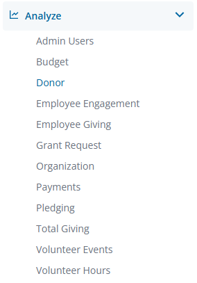
In the left-hand menu, select the "Analyze" option to view and choose from the available Explores. Create a new report by either building it from scratch by adding relevant fields or if any prebuilt Quick Start reports are available, select one of those as a starting point.
- NOTE: Pie charts require one dimension and one measure in the associated data table.
Step 2: Access the Pie Visualization type
The Pie icon in the Visualization toolbar will allow you to view the report as a pie chart.

Step 3: View the Plot Menu
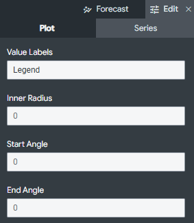
Click Edit in the right corner of the Visualization toolbar to access the Pie Visualization Plot Menu options.
Step 4: Select a Value Label
Value Labels allow you to change how individual sections of the pie chart are labeled for end users. There are three individual label types:
- None - Labels and the legend are not displayed.
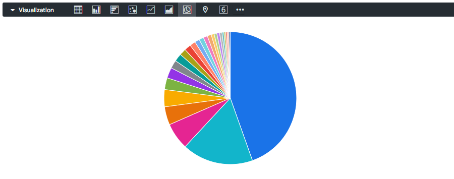
- Legend - The default option. Displays the legend at the bottom of the visualization.
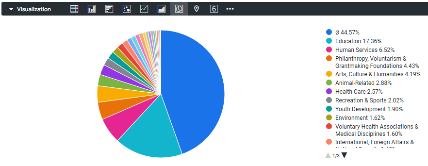
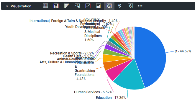
- Labels - Displays lines marking the individual sections of the pie chart.
Step 5: Access Lable Types
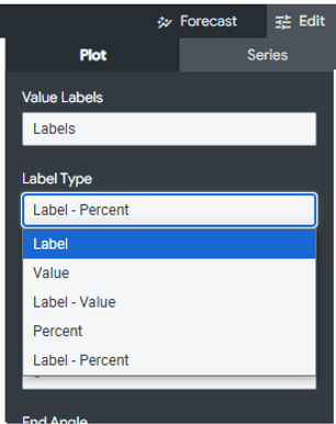
If “Labels” is selected as the “Value Label,” you will be prompted to select a Label Type to customize the format of the labels marking the sections of your pie chart. There are five ways you can customize your labels.
- Label - Displays the series name.
- Value - Displays the numeric value associated with the pie slice.
- Label - Value - Displays the series name in bold first, then the numeric value.
- Percent - Displays the percentage of the pie slice as a portion of the total pie.
- Label - Percent - Displays the series name in bold first, then the percentage.
Step 6: Adjust the Inner Radius
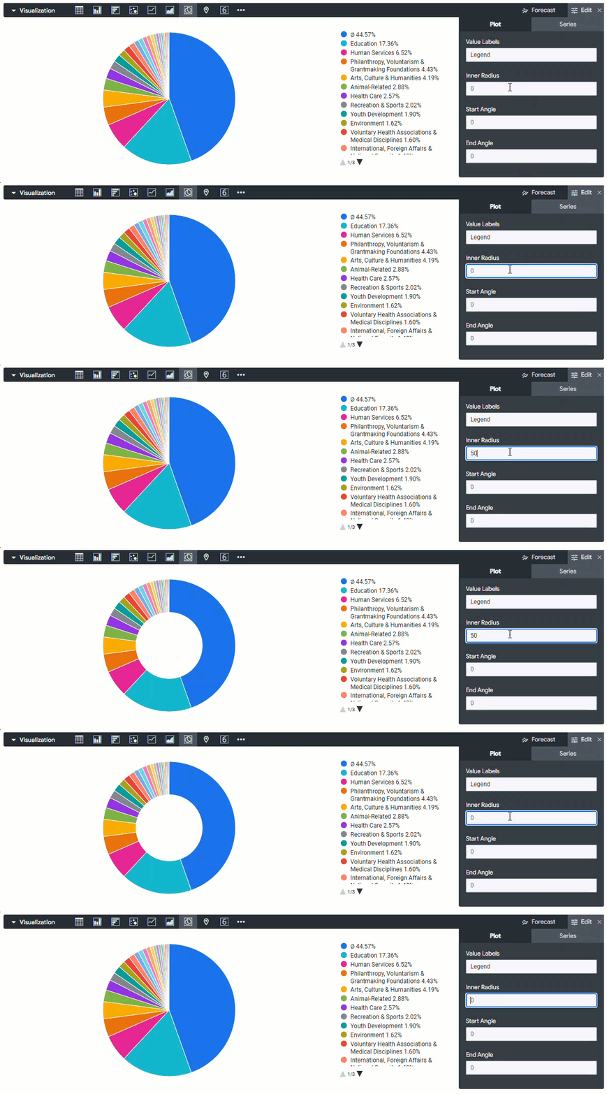
The Inner Radius option enables you to format a pie chart as a donut chart, by setting the radius for the "donut hole." This field accepts integers between 0 (smallest) and 100 (largest).
Step 7: Customize the Start and End Angles
The Start Angle and End Angle fields enable you to control whether the pie chart appears as a full circle or as a portion of a circle. These fields use the 360-degree angles of a circle, and numbers between -360 and 360 can be entered into them.
What else do you need help with?