Insights Pie Visualization Overview
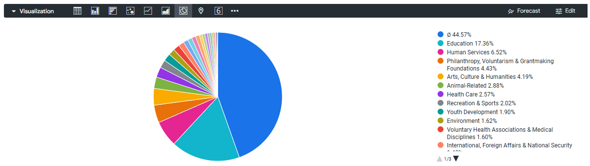
An Insights Pie Visualization is a type of data visualization that represents data in the form of a circular chart, where each slice of the pie corresponds to a different component or category within the data. Benefits of using an Insights Pie Visualization include its ability to quickly and easily convey information about the composition of a dataset, as well as its visual appeal and ease of interpretation.
Pie charts are useful for illustrating the proportions that several components contribute to a whole and require one dimension and one measure in the Insights Explore data table.
The Insights Pie Visualization feature offers a range of customization options, including the ability to control the appearance of the value labels, the format of the labels themselves, and the overall shape and orientation of the pie chart. Users can also customize the color palette used for the different slices of the pie and can adjust the series-level settings to further refine the visualization to their specific needs.
Feature Availability:
The Insights Visualization Types available within Insights Explores are accessible only to Insights Analysts. Administrators can manage Insights permissions for their program's internal users through the Users section in the Insights platform. Click Here to learn more about the Insights Self-Service User Management Portal.
To learn more about the Insights Pie Visualization type and its customization options, please see the articles below.
What do you need help with?