Insights users can leverage the Series Menu in a Pie Visualization to customize the appearance and layout of their data visualizations. The Series Menu allows users to define color palettes, adjust labels, and further refine the chart type, enabling them to create visually appealing and informative reports tailored to their specific needs.
Proceed as follows to learn more about using the Series Menu within an Insights Pie Visualization.
Step 1: Access Insights and choose an Explore
Log in to the CyberGrants platform and navigate to the Insights tab.

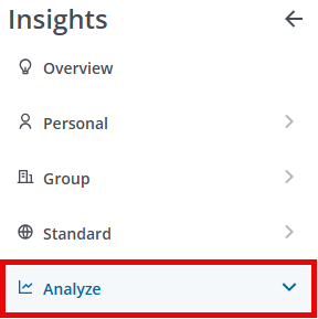
In the left-hand menu, select the "Analyze" option to view and choose from the available Explores.
Step 2: Build or select a report
Create a new report by either building it from scratch by adding relevant fields or if any prebuilt Quick Start reports are available, select one of those as a starting point.
- NOTE: Pie charts require one dimension and one measure in the associated data table.
Step 3: Access the Pie Visualization type
The Pie icon in the Visualization toolbar will allow you to view the report as a pie graph.

Step 4: View the Series Menu
Click Edit in the right corner of the Visualization toolbar to access the Pie Visualization Series Menu options.
Step 5: Define the Color Palette
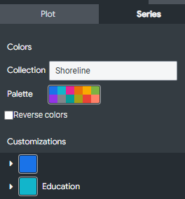
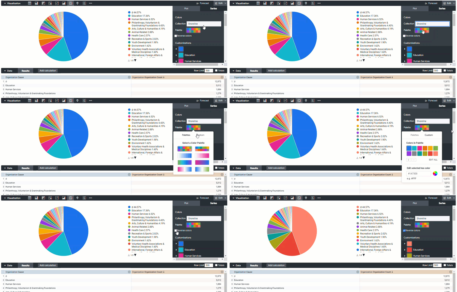
To define the color palette for a chart, you can select from a collection of predefined palettes or create a custom color palette.
- Collection - To choose a predefined color scheme, select it from the list of available Collections.
- Palette - To choose a predefined palette, click on the Palette option and select from the Palettes listed.
- Custom palette - To create a custom palette, click on the Palette option and select the Custom tab to adjust the Colors on the Palette including editing the hex color.
- Reverse colors - Toggle the color scheme of the pie chart series by reversing the selected colors.
Step 6: Customize the chart