The Values menu in the Insights Column Visualization allows you to customize the appearance and formatting of the data points and labels within the visualization. Users can change the visual presentation of the data to create clear and informative column charts tailored to meet specific program needs.
Proceed as follows to learn how to leverage the Values Menu in an Explore to customize the Column Visualization appearance.
Step 1: Access a report through an Insights Explore
Log in to the CyberGrants platform and navigate to the Insights tab.
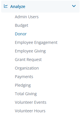
In the left-hand menu, select the "Analyze" option to view and choose from the available Explores.
Create a new report by either building it from scratch by adding relevant fields or if any prebuilt Quick Start reports are available, select one of those as a starting point.
Step 2: View the Column Visualization Values Menu
The Column icon in the Visualization toolbar will allow you to view the report as a column chart.
Click Edit in the right corner of the Visualization toolbar to access the Column Visualization Values Menu options.
Step 3: Activate Value Labels
The Value Labels option toggles the appearance of totals for each group of data points on the chart.
Step 4: Label Null Columns
The Label Null Columns option toggles the appearance of labels for null data points.
Step 5: Add Value Colors
Value Colors define the colors of the value labels. This field takes a comma-separated list of one or more color values. The color values can be formatted as RGB hex strings, such as #2ca6cd, or as CSS color names, such as medium blue.
Step 6: Update the Font Size
The Font Size option allows you to control the font size of value labels using any valid CSS size. Generally, users will specify a number of pixels, such as 12px.
Step 7: Change the Value Format
Value Format specifies the format of the value, independent of the underlying dimension or measure. The field accepts Excel-style formatting. If no formatting is specified, the value will be displayed in the format of the underlying dimension or measure.
Step 8: Customize Grouped and Stacked series using advanced Value options
Depending on whether the Series is displayed in a Grouped, Stacked, or Stacked Percentage arrangement, the Values Menu will surface relevant settings to optimize the visual representation of the data. Grouped and Stacked Series Positionings include the following advanced Value options.
Grouped Series Positioning Values Menu Options
-
Value Rotation - Sets the rotation of the value labels, and is only available when the Series Positioning has been set to Grouped. This parameter accepts values between -360 and 360, denoting the number of degrees to rotate the labels.
Stacked Series Positioning Values Menu Options
- Totals Labels - Toggles the appearance of totals for each stacked group of data points on a chart, and is only available when the Series Positioning has been set to Stacked.
- Show Silhouette of Disabled Series - Toggles a lightly shaded representation of a disabled series in a stacked chart, and is only available when the Series Positioning has been set to Stacked. Click on a series name in the bottom legend of the visualization to disable or enable the series in the visualization.
- Totals Color - Defines the color of the totals labels, and is only available when the Series Positioning has been set to Stacked.
- Totals Rotation - Sets the rotation of the totals labels, and is only available when the Series Positioning has been set to Stacked and the Totals Labels is activated. This parameter accepts values between -360 and 360, denoting the number of degrees to rotate the labels.