Using the X Menu Options within an Explore, Insights users can effectively customize the Column Visualization to ensure that data is presented in the most meaningful and visually appealing way. This includes tools to adjust the x-axis scale type, reverse the x-axis direction, show or hide x-axis labels and names, and configure time-based formatting.
Proceed as follows to customize the Column Visualization in Explore and optimize the presentation of your data using the X Menu.
Step 1: Access a report through an Insights Explore
Log in to the CyberGrants platform and navigate to the Insights tab.

In the left-hand menu, select the "Analyze" option to view and choose from the available Explores.
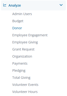
Create a new report by either building it from scratch by adding relevant fields or if any prebuilt Quick Start reports are available, select one of those as a starting point.
Step 2: View the Column Visualization X Menu
The Column icon in the Visualization toolbar will allow you to view the report as a column chart.

Click Edit in the right corner of the Visualization toolbar to access the Column Visualization X Menu options.
Step 3: Customize the Scale Type
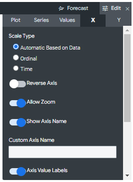
In the "X Menu Options," you can specify how the x-axis scale is calculated and displayed. Choose from "Automatic," "Ordinal," or "Time" scale types, depending on your data and preferences.
- Automatic Based on Data - The scale will be inferred from the underlying data. This is the default setting.
- Ordinal - The data is plotted along the x-axis as evenly spaced, discrete entries, regardless of the relative distance between data points.
- Time - The data is plotted as time values. The x-axis is labeled with appropriate time increments.
Step 4: Customize the X-Axis
In the "X Menu Options," you can further customize the x-axis using the following features.
- Reverse Axis - Toggle the direction of the x-axis. When this is off, values increase from left to right. When on, values decrease from left to right.
- Allow Zoom - Enabled by default and allows users to zoom in and out.
- Show Axis Name – Toggle the appearance of the x-axis name label.
- Custom Axis Name - Sets the name for the x-axis, and accepts any string value.
- Axis Value Labels – Toggle the appearance of value labels on the x-axis.
Step 5: Adjust the Gridlines
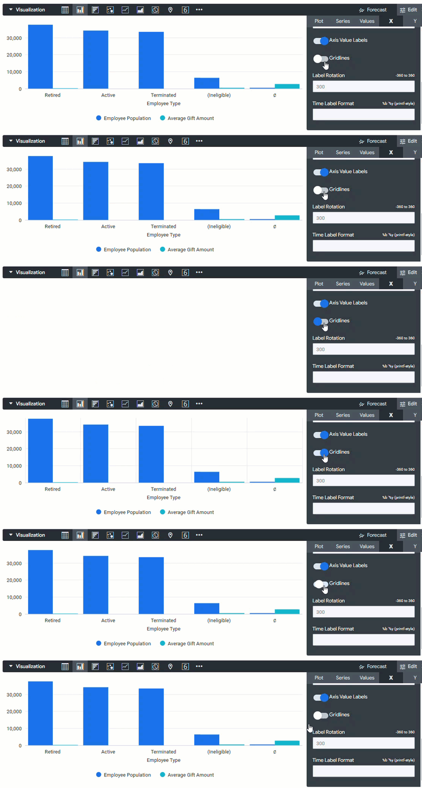
Adjust the toggle setting to update the visual appearance of the gridlines protruding from the x-axis.
Step 6: Update the Label Rotation
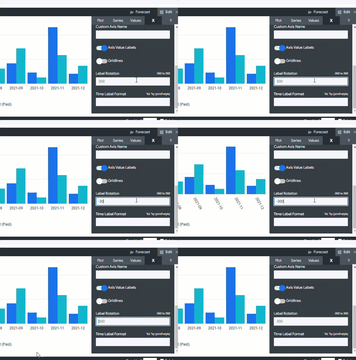
Set the rotation of the x-axis value labels. This parameter accepts values between -360 and 360, denoting the number of degrees to rotate the labels.
Step 7: Update the Time Label Format
If your data is time-based, configure the "Time Label Format" to display the desired date and time format. The Time Label Format specifies how x-axis value labels are displayed for charts with a time dimension on the x-axis. This parameter accepts time formatting syntax, as shown below:
- %b '%y, %H:%M displays Aug '14, 22:31
- %B %Y, %I:%M %p displays August 2014, 10:31 PM
- %x %X displays 12/15/2014 10:31:00
- %I:%M:%S %p displays 10:31:00 PM
What else do you need help with?