Insights Column Visualization Overview
The column visualization type is a versatile tool for presenting data in a clear and visually appealing manner. To effectively use this chart type, you'll need to configure a variety of settings, including the series positioning, column spacing, series customizations, value label formatting, x-axis options, and y-axis customizations.
Data in the column visualization type is displayed as a series of vertical bars, where the height of each bar represents the value of a particular data point or category. This is a common and widely used chart type for visualizing and comparing quantitative data across different categories or time periods.
Feature Availability:
The Insights Visualization Types available within Insights Explores are accessible only to Insights Analysts. Administrators can manage Insights permissions for their program's internal users through the Users section in the Insights platform. Click Here to learn more about the Insights Self-Service User Management Portal.
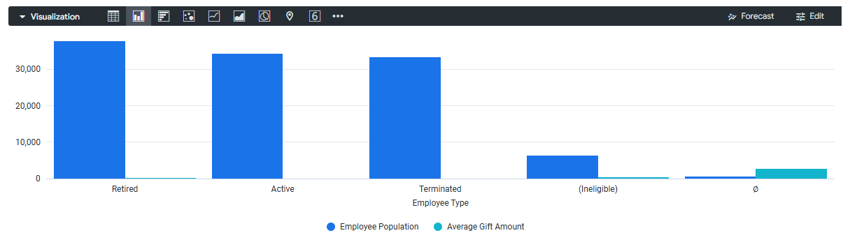
View the articles below to learn more about the Insights Column Visualization type and its customization options. Explore how to adjust the view, customize the columns, and leverage settings to enhance the appearance and functionality of the chart.
What do you need help with?
What else do you need help with?