Within an Insights Explore, users can leverage the X Menu options to effectively customize the Bar Visualization.
The X Menu Options provide a range of tools to optimize the bar chart's appearance and functionality, including adjusting the x-axis scale type, reversing the x-axis direction, showing or hiding x-axis labels and names, and configuring time-based formatting.
Proceed as follows to customize the Bar Visualization in Explore and optimize the presentation of your data using the X Menu.
Step 1: Access a report through an Insights Explore
Log in to the CyberGrants platform and navigate to the Insights tab.

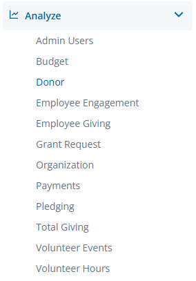
In the left-hand menu, select the "Analyze" option to view and choose from the available Explores.
Create a new report by either building it from scratch by adding relevant fields or if any prebuilt Quick Start reports are available, select one of those as a starting point.
Step 2: View the Bar Visualization X Menu
The Bar icon in the Visualization toolbar will allow you to view the report as a bar graph.

Click Edit in the right corner of the Visualization toolbar to access the Bar Visualization X Menu options.
Step 3: Customize the Scale Type
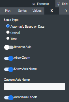
In the "X Menu Options," you can specify how the x-axis scale is calculated and displayed. Choose from "Automatic," "Ordinal," or "Time" scale types, depending on your data and preferences.
- Automatic Based on Data - The scale will be inferred from the underlying data. This is the default setting.
- Ordinal - The data is plotted along the x-axis as evenly spaced, discrete entries, regardless of the relative distance between data points.
- Time - The data is plotted as time values. The x-axis is labeled with appropriate time increments.
Step 4: Customize the X-Axis
In the "X Menu Options," you can further customize the x-axis using the following features.
- Reverse Axis - Toggle the direction of the x-axis. When this is off, values increase from left to right. When on, values decrease from left to right.
- Allow Zoom - Enabled by default and allows users to zoom in and out.
- Show Axis Name – Toggle the appearance of the x-axis name label.
- Custom Axis Name - Sets the name for the x-axis and accepts any string value.
- Axis Value Labels – Toggle the appearance of value labels on the x-axis.
Step 5: Adjust the Gridlines
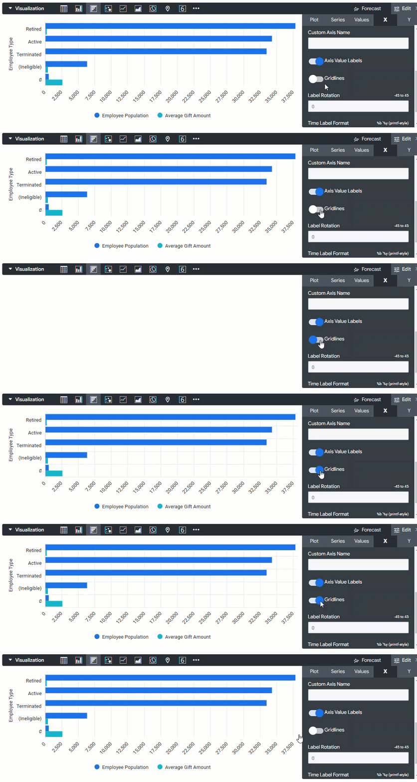
Adjust the toggle setting to update the visual appearance of the gridlines protruding from the x-axis.
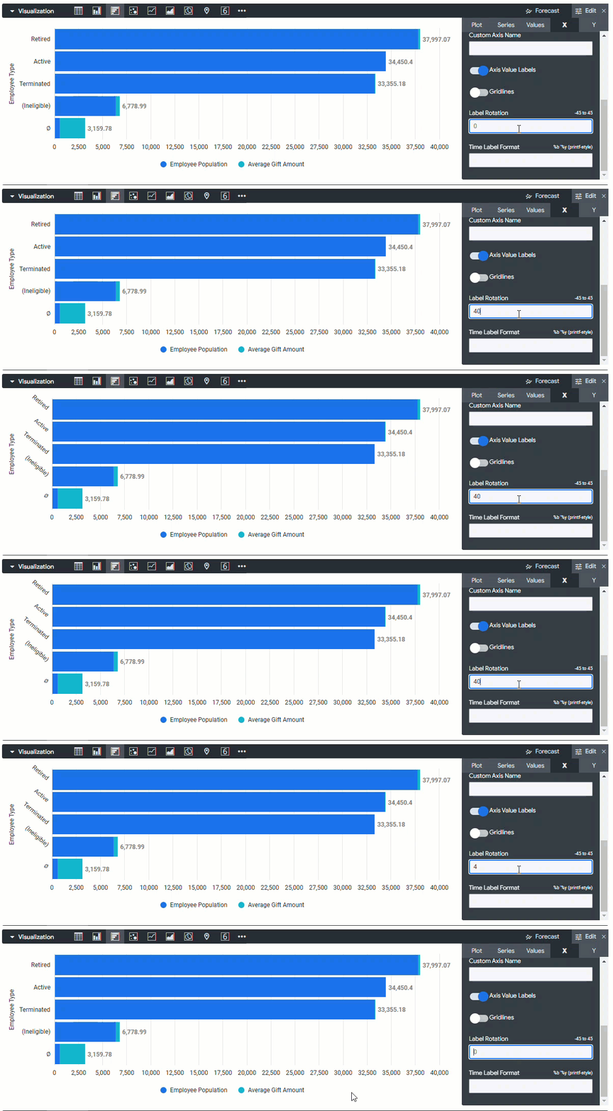
Step 6: Update the Label Rotation
Use the Label Rotation option to set the rotation of the x-axis value labels. This parameter accepts values between -360 and 360, denoting the number of degrees to rotate the labels.
Step 7: Update the Time Label Format
If your data is time-based, configure the "Time Label Format" to display the desired date and time format. The Time Label Format specifies how x-axis value labels are displayed for charts with a time dimension on the x-axis. This parameter accepts time formatting syntax, as shown below:
- %b '%y, %H:%M displays Aug '14, 22:31
- %B %Y, %I:%M %p displays August 2014, 10:31 PM
- %x %X displays 12/15/2014 10:31:00
- %I:%M:%S %p displays 10:31:00 PM
What else do you need help with?