Insights Bar Visualization Overview
The Bar Visualization in the Insights Explore feature provides users with a powerful tool to visualize and analyze data in a bar graph format allowing users to create bar charts that can effectively convey complex information.
The Bar Visualization offers a range of menu options to fine-tune the chart's appearance and functionality. Users can customize the appearance and layout of the Bar Visualization including the ability to adjust the grid layout, define color palettes, control the display of value labels, and customize the x-axis and y-axis scales. Additionally, users can leverage advanced features such as the addition of reference lines and trend lines to enhance their data analysis.
Feature Availability:
The Insights Visualization Types available within Insights Explores are accessible only to Insights Analysts. Administrators can manage Insights permissions for their program's internal users through the Users section in the Insights platform. Click Here to learn more about the Insights Self-Service User Management Portal.
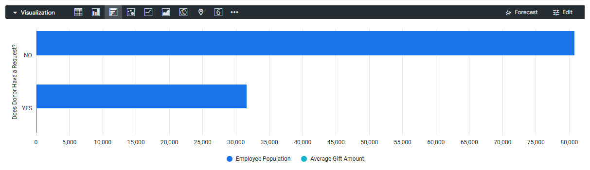
View the articles below to learn more about the Insights Bar Visualization type and its customization options. Explore how to adjust the view, customize the axes, and leverage settings to enhance the appearance and functionality of the chart.
What do you need help with?
What else do you need help with?