The Y-axis menu within the Bar Visualization of an Insights Explore provides users with a comprehensive set of customization options.
Users can adjust various aspects of the bar chart, such as gridlines, y-axis direction, top and bottom axes configuration, scale type, y-axis formatting, tick density, value limits, and the application of reference and trend lines. Leveraging these menu options allows users to optimize the bar chart visualization to effectively represent and analyze their data.
Proceed as follows to customize the Bar Visualization in Explore using the Y Menu.
Step 1: Access a report through an Insights Explore
Log in to the CyberGrants platform and navigate to the Insights tab.

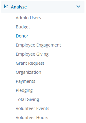
In the left-hand menu, select the "Analyze" option to view and choose from the available Explores.
Create a new report by either building it from scratch by adding relevant fields or if any prebuilt Quick Start reports are available, select one of those as a starting point.
Step 2: View the Bar Visualization Y Menu
The Bar icon in the Visualization toolbar will allow you to view the report as a bar chart.

Click Edit in the right corner of the Visualization toolbar to access the Bar Visualization Y Menu options.
Step 3: Customize the Bar Chart View
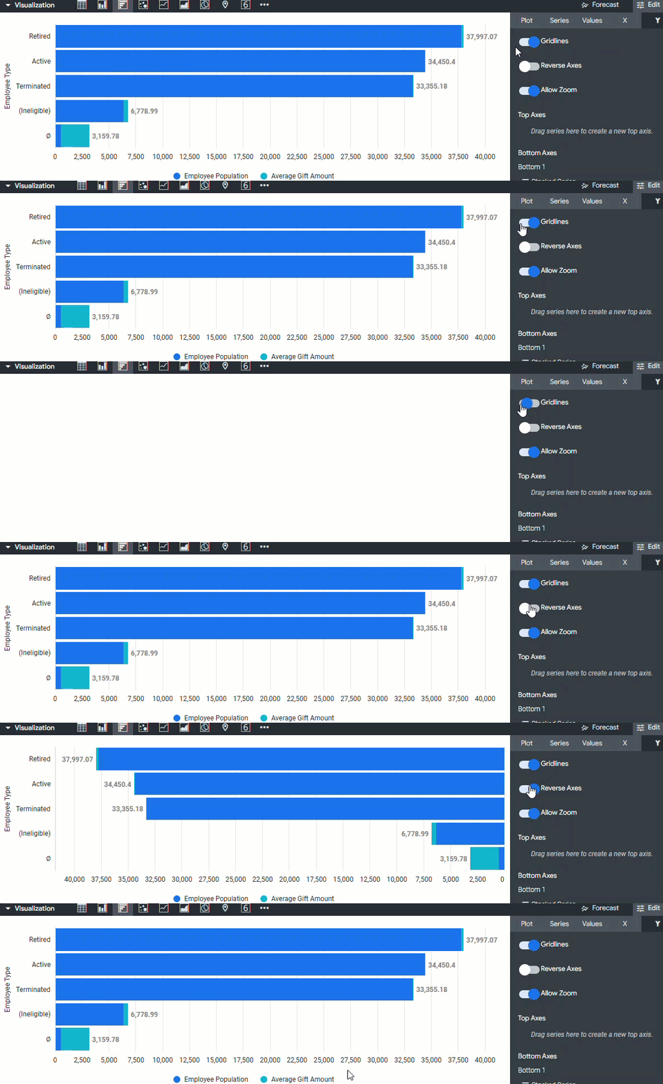
Insights users can customize the Bar chart view by adjusting the gridlines, reversing the y-axis direction, and toggling access to the zoom functionality.
- Gridlines - Toggles the appearance of gridlines extending from the y-axis.
- Reverse Axis - Toggles the direction of the y-axis. When this is off, values increase going up the axis. When this is on, values decrease going up the axis.
- Allow Zoom - Enabled by default and allows users to zoom in and out.
Step 4: Configure the Top and Bottom Axes
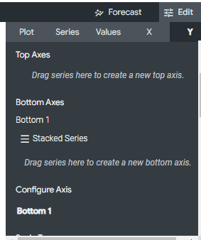
Users can configure the top and bottom axes to display one or more y-axis on each side of the chart and customize each y-axis.
- Top Axes and Bottom Axes - This lets you configure the chart’s y-axis. On the top and bottom of the chart, you can have one or more y-axes, each associated with one or more data series.
- Configure Axis - Displays a tab for each y-axis configured in the Top Axes and Bottom Axes sections. Click on the tab for an axis to configure that y-axis. You configure each y-axis separately using its own set of configuration options.
Step 5: Identify the Scale Type
The Scale Type specifies how the y-axis scale is calculated and displayed.
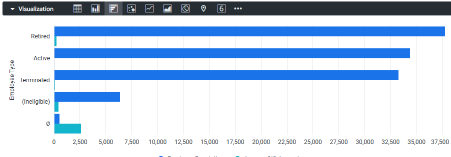
- Linear - The data is plotted along the y-axis as evenly spaced, discrete entries, regardless of the relative distance between data points. This is the default setting. Most data is best displayed on a linear scale.
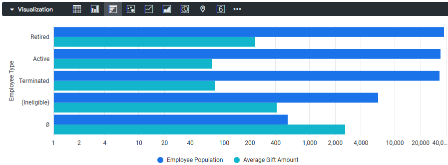
- Logarithmic - The data is plotted along the y-axis using a logarithmic scale, which is based on orders of magnitude. If the data has a cluster of very small and very large values, this setting enables you to see variation in the small values while also showing the larger values. The logarithmic scale type can only be used for data with positive values and is only available when you have a Series Positioning set to Grouped.
Step 6: Update the Y-Axis Format
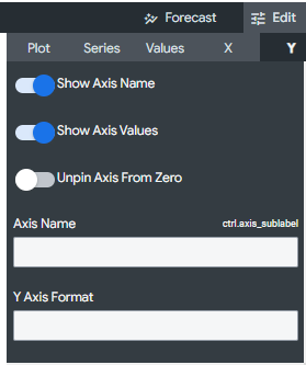
Users can update the y-axis format by showing/hiding the axis name and values, unpinning the axis from zero, renaming the axis, and specifying the number format.
- Show Axis Name - Toggles the appearance of y-axis name labels.
- Show Axis Values - Toggles the appearance of y-axis values.
- Unpin Axis from Zero - Toggles letting the chart focus on the area for which data exists, rather than showing the full scale starting at zero.
- Axis Name - This lets you enter the label for the selected y-axis.
- Y-Axis Format - Specifies the number format of the y-axis values, independent of the underlying dimension or measure.
Step 7: Adjust the Tick Density
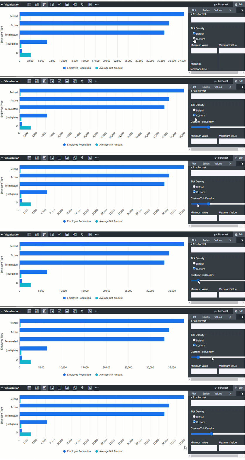
If the Scale Type is set to Linear or the series positioning is configured to be Stacked or Stacked Percentage, users can adjust the density of the tick marks displayed along the y-axis.
- Default - Sets ticks to the default density.
- Custom - Enables you to set ticks with a custom density. Selecting this option will display a slider bar where you can set the custom density.
Step 8: Update the Value Limits
Users can update the value limits by defining the minimum and maximum values for the selected y-axis.
- Minimum Value - Defines the minimum value for the selected y-axis.
- Maximum Value - Defines the maximum value for the selected y-axis.
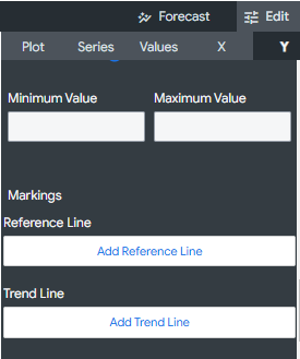
Step 9: Apply Markings