Insights users have access to a powerful Line Visualization Plot Menu that allows them to customize the appearance and behavior of line charts. This menu provides options for adjusting the series positioning, grid layout, line interpolation, handling of null values, axis orientation, and legend display. By leveraging these features, Insights users can create visually compelling and informative line charts that effectively communicate their data insights.
Proceed through the steps below to learn how to leverage the Plot Menu in a Line Visualization.
Step 1: Access a report through an Insights Explore
Log in to the CyberGrants platform and navigate to the Insights tab.

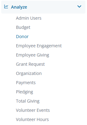
In the left-hand menu, select the "Analyze" option to view and choose from the available Explores. Create a new report by either building it from scratch by adding relevant fields or if any prebuilt Quick Start reports are available, select one of those as a starting point.
Step 2: View the Line Visualization Plot Menu
The Line icon in the Visualization toolbar will allow you to view the report as a line chart.

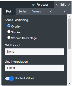
Click Edit in the right corner of the Visualization toolbar to access the Line Visualization Plot Menu options.
Step 3: Select a Series Positioning
The Series Positioning option specifies how series are clustered visually on a chart.
- Overlay - Series are overlayed on the chart.
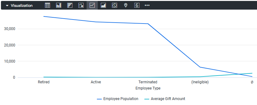
- Stacked - Series values are added on the y-axis, so each consecutive series appears above the last. Be sure that the units of all series match.
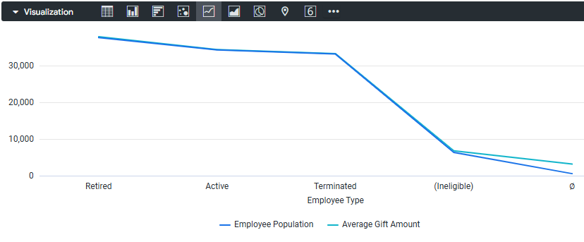
- Stacked Percentage - Series values are presented as percentages stacked on the y-axis, where all values add up to 100%.
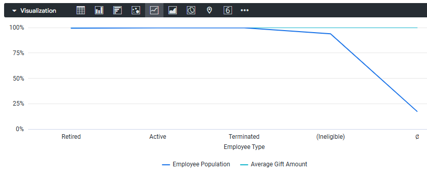
Step 4: Choose a Grid Layout
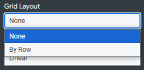
The Grid Layout provides options to separate, or trellis, a chart into several smaller charts, each representing a single row or pivot from the results table. You can separate a chart into a maximum of 12 smaller charts.
Step 5: Update the Line Interpolation
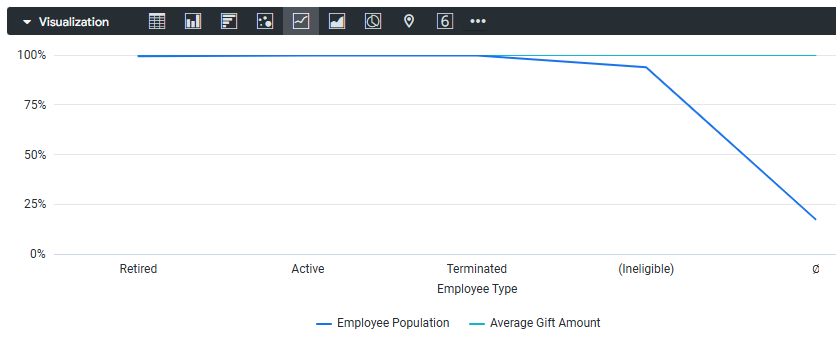
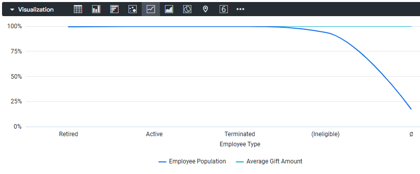
The Line Interpolation specifies how lines are drawn on the chart.
- Linear - Displays straight lines between points
- Monotone - Displays smooth curves between points
- Step (center) - Points are connected by steps, with the data point located in the middle of the step
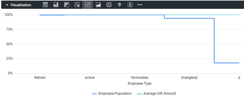
- Step (before) - Points are connected by steps, with the data point located at the beginning of the step
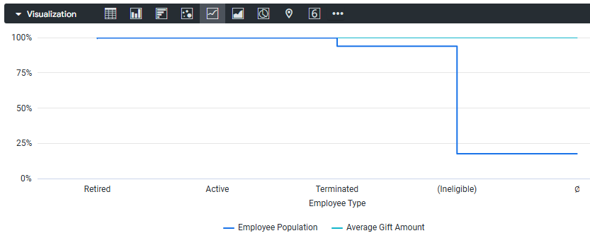
- Step (after) - Points are connected by steps, with the data point located at the end of the step
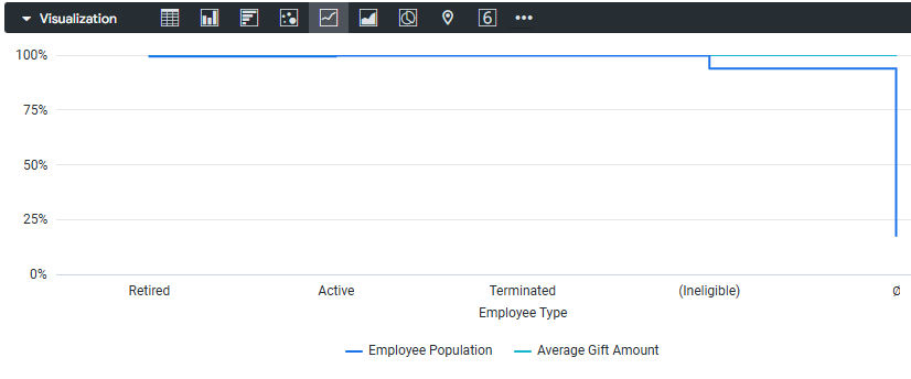
Step 6: Adjust the view of Plot Null Values
Plot Null Values toggles the appearance of null values on the chart and is only an option when the Series Position is set to Overlay. When toggled on, null values are plotted at zero. When toggled off, sections of line and area charts may show gaps.
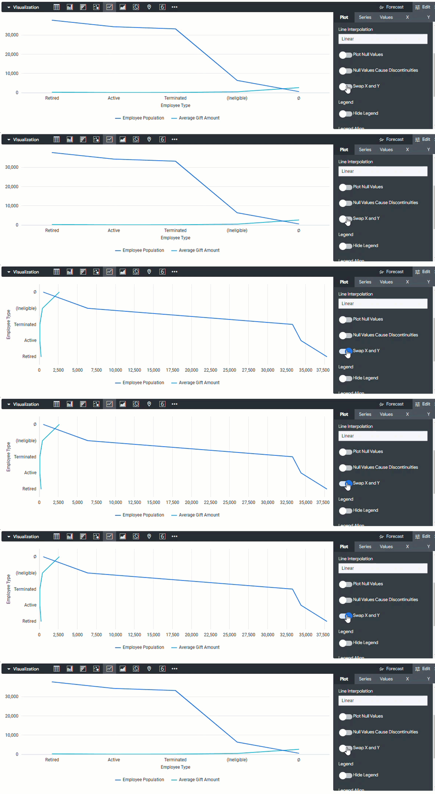
Step 7: Swap X and Y
The Swap X and Y option toggles whether the x and y axes are swapped from the normal configuration. When swapped, dimensions will be plotted on the y-axis, and measures will be plotted on the x-axis.
Step 8: Update the Legend
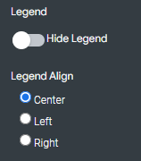
The Insights platform offers the ability to toggle the visibility of the series legend, as well as adjust the alignment of the legend to the left, center, or right of the chart.
- Hide Legend - Toggles the appearance of the series legend on a chart.
- Legend Align - Specifies whether the series legend will appear to the left, center, or right of the chart. This is only available when Hide Legend is off and when there is more than one series.
Step 9: Change the Data view
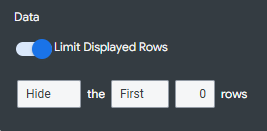
Insights allows users to Limit Displayed Rows to show or hide rows in a visualization, based on their position in the results.
- When toggled on, you will see additional options to complete: [Hide/Show the First/Last # Rows]. In the data table below your visualization, any excluded rows will be shown in a darker color.
What else do you need help with?