The Y-axis menu within the Line Visualization of an Insights Explore provides users with a range of options to customize the appearance and behavior of the chart's y-axis. This includes the ability to adjust gridlines, reverse the axis direction, configure multiple y-axes, and select the appropriate scale type for the data being displayed.
Proceed as follows to customize the Line Visualization in Explore using the Y Menu.
Step 1: Access a report through an Insights Explore
Log in to the CyberGrants platform and navigate to the Insights tab.

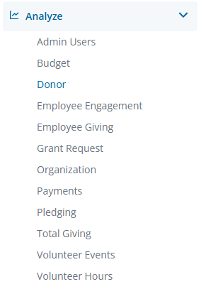
In the left-hand menu, select the "Analyze" option to view and choose from the available Explores. Create a new report by either building it from scratch by adding relevant fields or if any prebuilt Quick Start reports are available, select one of those as a starting point.
Step 2: View the Line Visualization Y Menu
The Line icon in the Visualization toolbar will allow you to view the report as a line chart.

Click Edit in the right corner of the Visualization toolbar to access the Line Visualization Y Menu options.
Step 3: Customize the Line Chart View
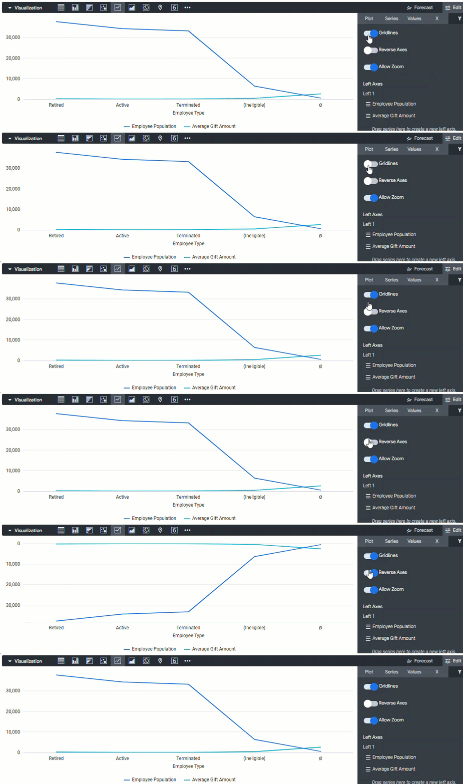
Insights users can customize the Line chart view by adjusting the gridlines, reversing the y-axis direction, and toggling access to the zoom functionality.
- Gridlines - Toggles the appearance of gridlines extending from the y-axis.
- Reverse Axis - Toggles the direction of the y-axis. When this is off, values increase going up the axis. When this is on, values decrease going up the axis.
- Allow Zoom - Enabled by default and allows users to zoom in and out.
Step 4: Configure the Left and Right Axes
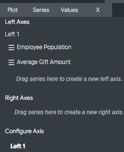
Users can configure the left and right axes to display one or more y-axiss on each side of the chart and customize each y-axis.
- Left Axes and Right Axes - Let you configure the chart’s y-axis. On the left and right side of the chart, you can have one or more y-axes, each associated with one or more data series.
- Configure Axis - Displays a tab for each y-axis configured in the Left Axes and Right Axes sections. Click on the tab for an axis to configure that y-axis. You configure each y-axis separately using its own set of configuration options.
Step 5: Identify the Scale Type
The Scale Type specifies how the y-axis scale is calculated and displayed.
- Linear - The data is plotted along the y-axis as evenly spaced, discrete entries, regardless of the relative distance between data points. This is the default setting. Most data is best displayed on a linear scale.
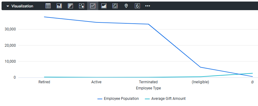
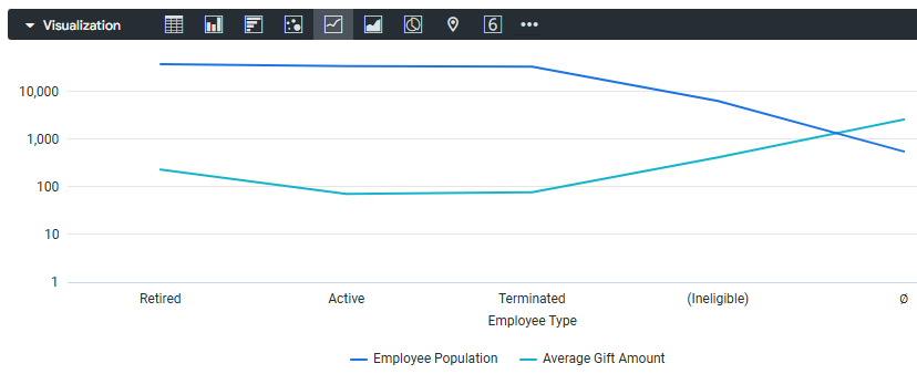
- Logarithmic - The data is plotted along the y-axis using a logarithmic scale, which is based on orders of magnitude. If the data has a cluster of very small and very large values, this setting enables you to see variation in the small values while also showing the larger values.
- The logarithmic scale type can only be used for data with positive values and is only available when you have a Series Positioning set to Overlay.
Step 6: Update the Y-Axis Format
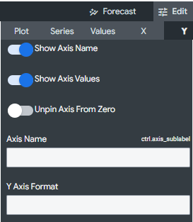
Users can update the y-axis format by showing/hiding the axis name and values, unpinning the axis from zero, renaming the axis, and specifying the number format.
- Show Axis Name - Toggles the appearance of y-axis name labels.
- Show Axis Values - Toggles the appearance of y-axis values.
- Unpin Axis from Zero - Toggles letting the chart focus on the area for which data exists, rather than showing the full scale starting at zero.
- Axis Name - This lets you enter the label for the selected y-axis.
- Y-Axis Format - Specifies the number format of the y-axis values, independent of the underlying dimension or measure.
Step 7: Adjust the Tick Density
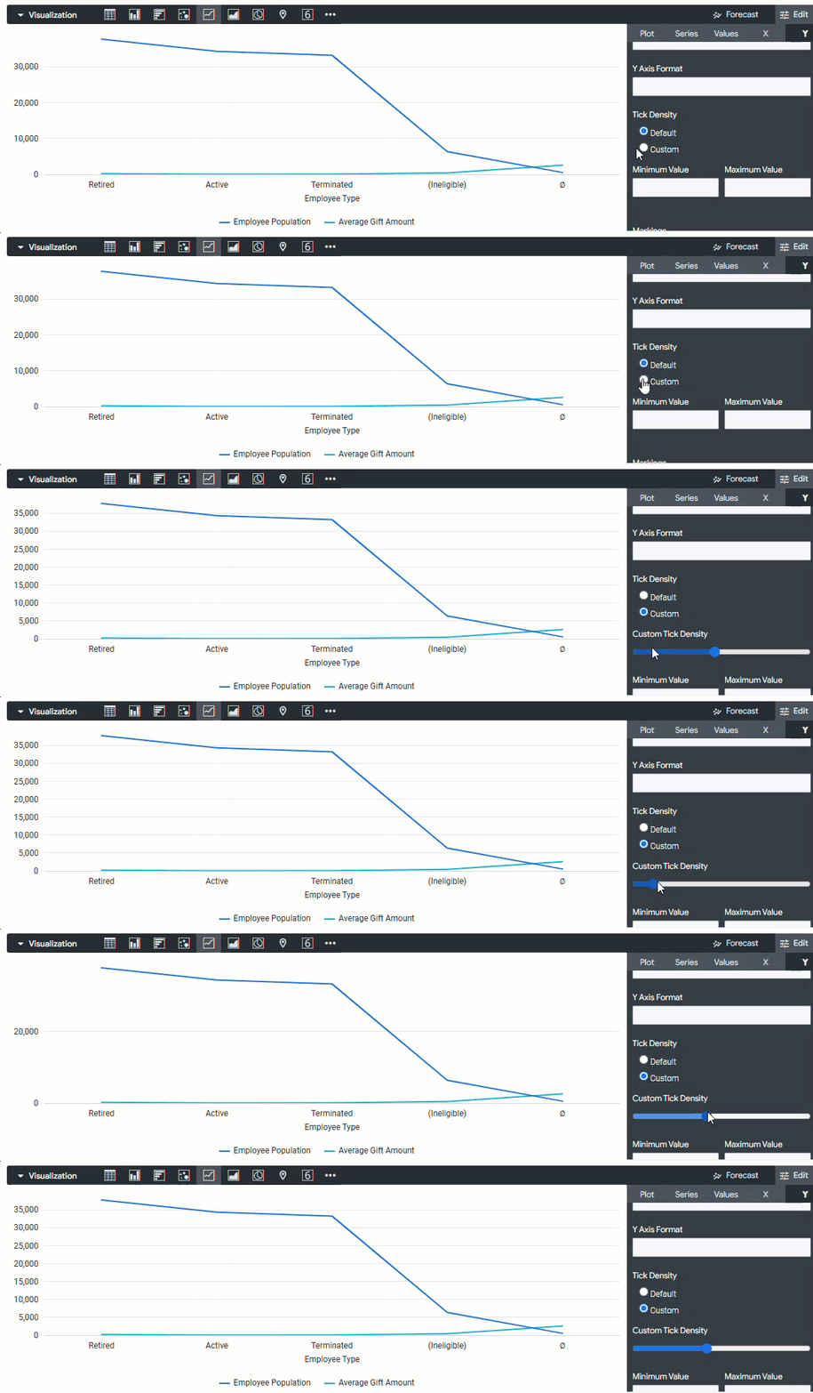
The Tick Density sets the density of tick marks on the y-axis.
- Default - Sets ticks to the default density.
- Custom - Enables you to set ticks with a custom density. Selecting this option will display a slider bar where you can set the custom density.
Step 8: Update the Value Limits
Users can update the value limits by defining the minimum and maximum values for the selected y-axis.
- Minimum Value - Defines the minimum value for the selected y-axis.
- Maximum Value - Defines the maximum value for the selected y-axis.
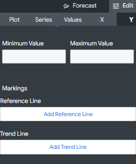
Step 9: Apply Markings
Users can apply markings by adding reference lines and trend lines to the chart, with the latter not supported for certain chart configurations.
- Add Reference Line - Enables the creation of reference lines in a chart. Click it as many times as you like to add any number of reference lines and reveal the settings for those reference lines.
- Add Trend Line - Trend lines show the prevailing direction of the data in a chart. If your chart can support a trend line, you will see the Add Trend Line button in the Y menu options. Trend lines are not supported for the following use cases:
- Charts with a Stacked or Stacked Percentage series positioning type
- Charts with a By Row grid layout
- Charts with an Ordinal x-axis scale type
What else do you need help with?