The Comparison Menu in an Insights Single Value Visualization allows users to add comparison information to a single numeric value. This feature enables users to view the current value alongside a comparison value, such as a previous period or target, and customize the display of this comparison data.
Proceed through the steps below to access, enable, and configure the Comparison Menu options within an Insights Single Value Visualization.
Step 1: Access Insights and choose an Explore
Log in to the CyberGrants platform and navigate to the Insights tab.

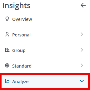
In the left-hand menu, select the "Analyze" option to view and choose from the available Explores.
Step 2: Build or select a report
Create a new report by either building it from scratch by adding relevant fields or if any prebuilt Quick Start reports are available, select one of those as a starting point.
Step 3: View the Single Value Visualization Comparison Menu
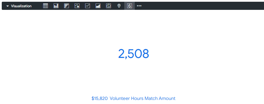
The single-value icon in the Visualization toolbar will allow you to view the report as a single numeric value.

Navigate to the Comparison menu options in the Insights Single Value Visualization type.
Step 4: Enable Comparison
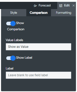
Enable the "Show Comparison" feature to use a second field to add comparison information to the single-value visualization.
- In general, the comparison value uses the next field that would be displayed as the single value visualization.
Step 5: Set Value Labels
The Value Labels setting specifies how the comparison field is used in the single value visualization. The available options include:
- Show as Value - The value of the comparison field is displayed at the bottom.
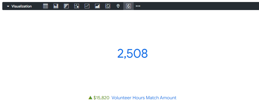
- Show as Change - The value of the comparison field is displayed at the bottom. If the value is negative, a triangle points downwards. If the value is positive, the triangle points upward. By default, a negative number is displayed in red with a red triangle, and a positive number is displayed in green with a green triangle.
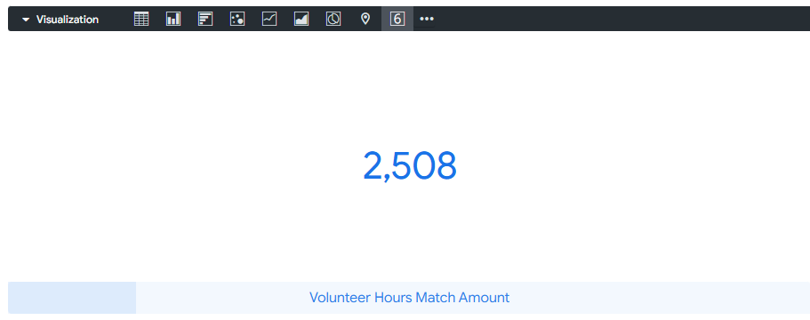
- Calculate Progress - The value of the field used for the single-value visualization is divided by the comparison field's value. This percentage is displayed as a progress bar.
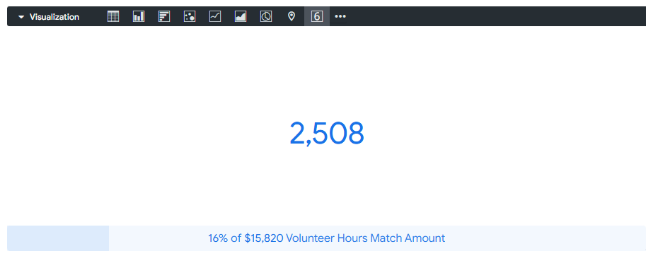
- Calculate Progress (with Percentage) - The value of the field used for the single-value visualization is divided by the comparison field's value. This percentage is displayed as a progress bar, and the bar is labeled with the percentage and the value of the comparison field, such as "88% of $500,000".
Step 6: Customize Positive Values are Bad
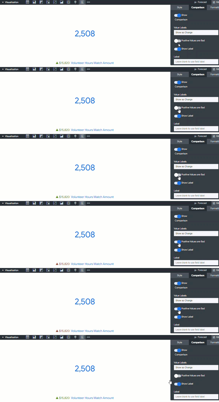
If the Value Label is set to "Show as Change", you will find the Positive Values are Bad option. Enabling this option specifies that negative numbers should be displayed as green text with a green triangle, while positive numbers should appear as red text with a red triangle.
Step 7: Update Label
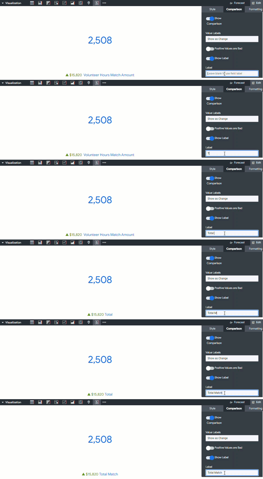
The Show Label setting determines whether a label is shown with the comparison field.
- If the "Show Label" option is enabled, you will find the "Label" setting. This setting allows you to provide a different label for the comparison field's name.
What else do you need help with?
Not what you're looking for? Navigate to Understanding the Insights Single Value Visualization