The Value menu in an Insights Google Map Visualization provides users with customization options to enhance the visual representation of their data. Users can access settings to tailor the map to their specific needs, such as adjusting the Value Colors, Quantizing Colors, Reversing the Color Scale, and updating the Minimum Value and Maximum Value fields.
Proceed as follows to utilize the Value menu in an Insights Google Map Visualization.
Step 1: Access a report through an Insights Explore
Log in to the CyberGrants platform and navigate to the Insights tab.

In the left-hand menu, select the "Analyze" option to view and choose from the available Explores.
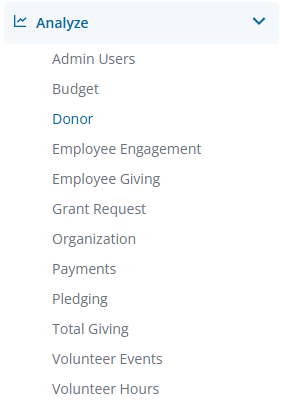
Create a new report by either building it from scratch by adding relevant fields or if any prebuilt Quick Start reports are available, select one of those as a starting point.
Step 2: View the Google Maps Visualization Value Menu
Use the ellipsis in the Visualization toolbar to access the Google Maps Visualization type.

Click Edit in the right corner of the Visualization toolbar to access the Google Maps Visualization Value Menu options.
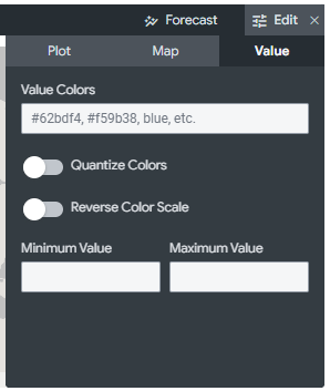
Step 3: Adjust the Value Colors
This feature allows users to set the color of map points or define the range of colors to be used for color-coding based on a specific measure. The input field accepts a comma-separated list of one or more color values, which can be formatted as RGB hex strings (e.g., #2ca6cd) or CSS color names (e.g., mediumblue).
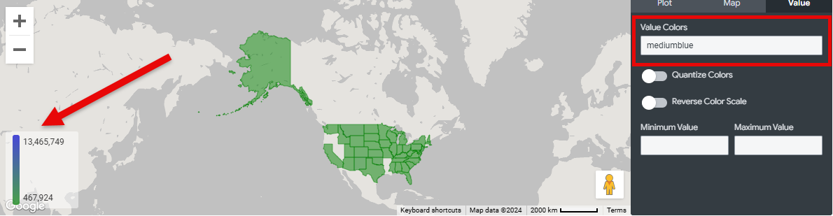
Step 4: Quantize Colors
When this option is enabled, the color scale is changed from a smooth gradient to only the specific colors that have been set.
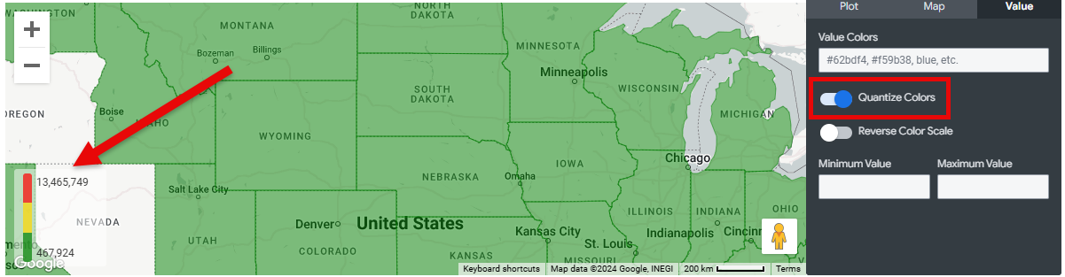
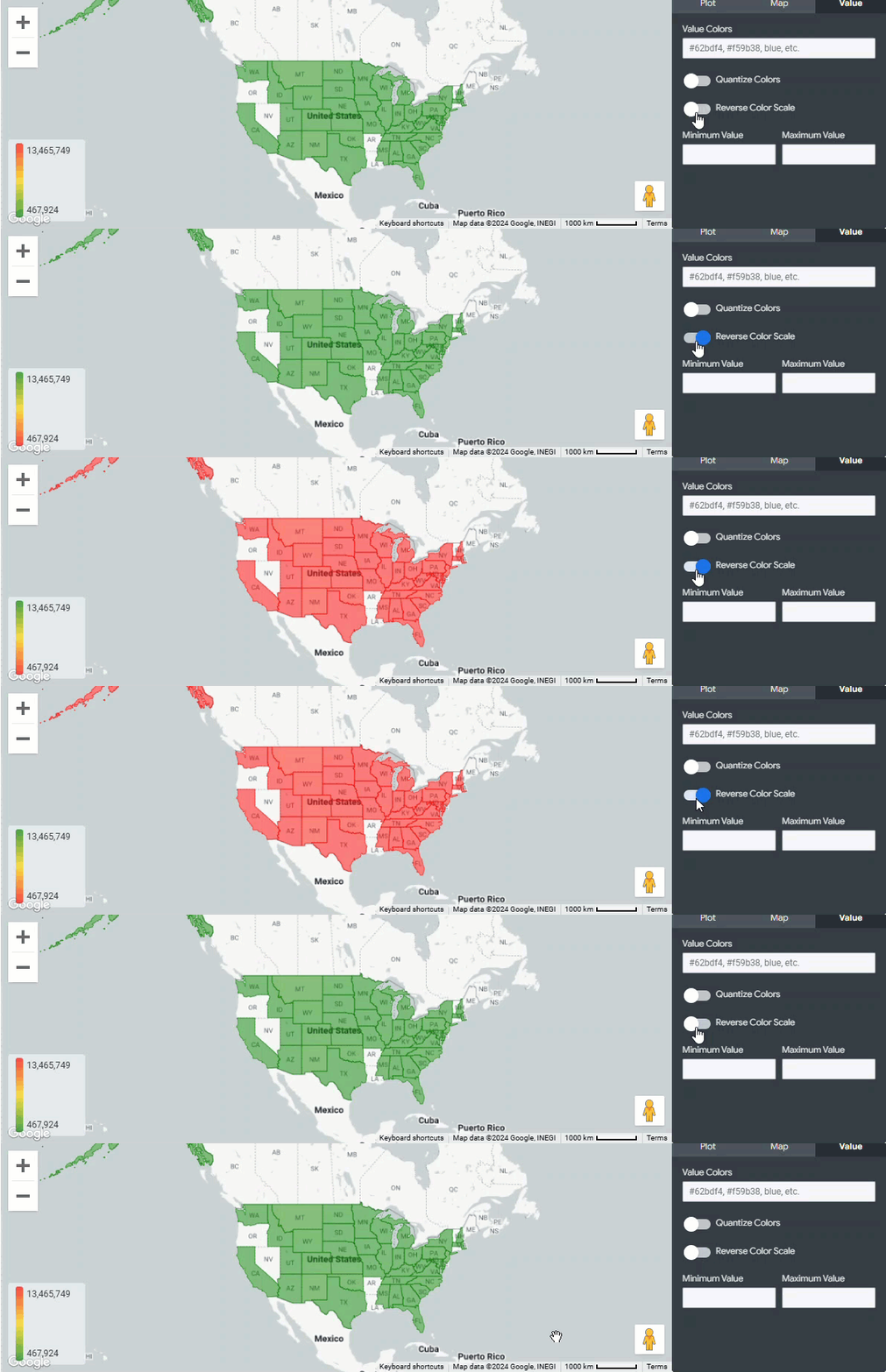
Step 5: Reverse Color Scale
When this option is turned on, the colors indicating high and low values on the chart are switched, effectively reversing the color gradient.
Step 6: Update the Minimum Value and Maximum Value
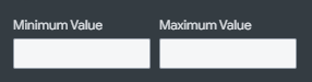
This feature allows users to set the minimum and maximum values of the color range. By default, this field is left blank, and the minimum and maximum values applied on the legend are the minimum and maximum values from the query.
What else do you need help with?
Not what you're looking for? Navigate to Understanding the Insights Google Maps Visualization