Insights users have access to a range of options for customizing the appearance and functionality of the Table Visualization. Proceed as follows to learn how to leverage the Plot Menu in an Explore to adjust the Table Visualization presentation and readability of data.
Step 1: Access Insights and choose an Explore
Log in to the CyberGrants platform and navigate to the Insights tab.

In the left-hand menu, select the "Analyze" option to view and choose from the available Explores.
Step 2: Build or select a report
Create a new report by either building it from scratch by adding relevant fields or if any prebuilt Quick Start reports are available, select one of those as a starting point.
Step 3: Access the Table Visualization type
The Table icon in the Visualization toolbar will allow you to view the report as a table listing the data in individual columns.

Step 4: Customize the table's appearance
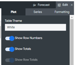
Click Edit in the right corner of the Visualization toolbar to access the Table Visualization Plot Menu options.
- Table Theme - Provides several table coloring options to choose from.
- Show Row Numbers - Toggles whether to show a row number at the beginning of each table. This option will be disabled if you are using subtotals in your table chart.
- Show Totals - Toggles whether to show column totals at the bottom of each table column. This option will be disabled when Totals are not added to your report.
- Show Row Totals - Toggles whether to show row totals at the beginning or end of each table row. This option will be disabled when row totals are not added to your pivoted report.
Step 5: Transpose the table
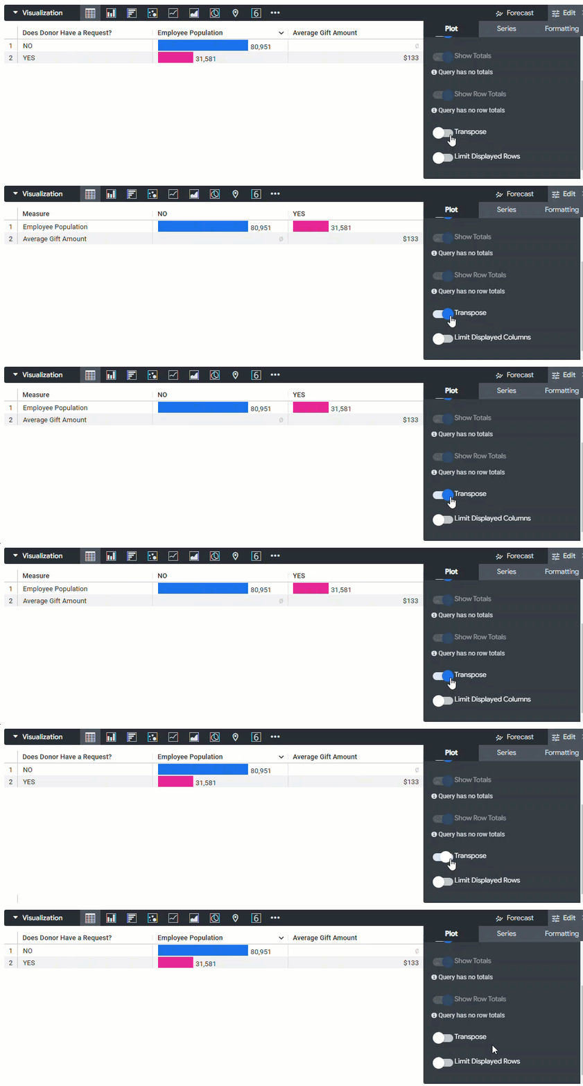
The Transpose option is available for visualizations that contain only one dimension. When selected, the visualization's rows will switch to columns and the columns will switch to rows.
Step 6: Limit Displayed Rows
The Limit Displayed Rows option enables you to show or hide rows in a visualization, based on their position in the results. When toggled on, you will see additional options to complete: [Hide/Show the First/Last # Rows]. In the data table below your visualization, any excluded rows will be shown in a darker color.
What else do you need help with?
Not what you're looking for? Navigate to Understanding the Insights Table Visualization