The Series Menu options provide Insights users the ability to tailor the appearance and formatting of data within the Table Visualization of an Explore. Insights users can customize the appearance and formatting of the data visualization including adjusting column labels, widths, and numeric formatting, as well as applying cell text layout and cell visualization settings.
Proceed as follows to access the Series Menu options in the Table Visualization.
Step 1: Access Insights and choose an Explore
Log in to the CyberGrants platform and navigate to the Insights tab.

In the left-hand menu, select the "Analyze" option to view and choose from the available Explores.
Step 2: Build or select a report
Create a new report by either building it from scratch by adding relevant fields or if any prebuilt Quick Start reports are available, select one of those as a starting point.
Step 3: Access the Table Visualization type
The Table icon in the Visualization toolbar will allow you to view the report as a table listing the data in individual columns.

Step 4: Explore the Series Menu options
Click Edit in the right corner of the Visualization toolbar to access the Table Visualization Series Menu options.
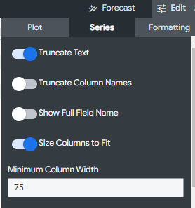
- Truncate Text - When toggled on (which is the default option), the text that appears in column data cells will be truncated and followed by an ellipse. When off, the text will wrap to subsequent lines.
- Truncate Column Names - When toggled on, the text that appears in column headers will be truncated and followed by an ellipse. When off, the text will wrap to subsequent lines.
- Show Full Field Name - Toggles whether to show the view name along with the field name for each column header. When off, only the field name shows.
- Size Columns to Fit - Sizes the widths of all columns so that the table perfectly fits the width of the pane in which you are viewing it. The default setting is on, however, if this results in columns that are too narrow to be readable, Insights will automatically auto-size each column based on its longest data value.
- Minimum Column Width - Set a minimum column width by entering in a numeric value.
Step 5: Customize the table's appearance
The Customization options allow you to customize each column in the visualization, including labels, width, formatting, and cell visualizations.
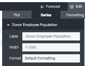
- Labels - Click on the "Labels" option to create a custom label for each column that will appear in the visualization.
- Width - Adjust the "Width" setting for each column by entering a number between 1 (narrowest) and 1,000 (widest).
- Format - For columns with numeric data, use the "Format" dropdown to select a predefined format option (similar to Excel).
Step 6: Update the Cell Text, Subtotal, and Visualization
- Cell Text Layout - Customize the font color, background fill color, bold/italic/underline font styling, and horizontal alignment for the text inside the data cells for that column.
- Collapse Subtotal - If your visualization has subtotals, enable the "Collapse Subtotal" option to collapse all subtotals for that column.
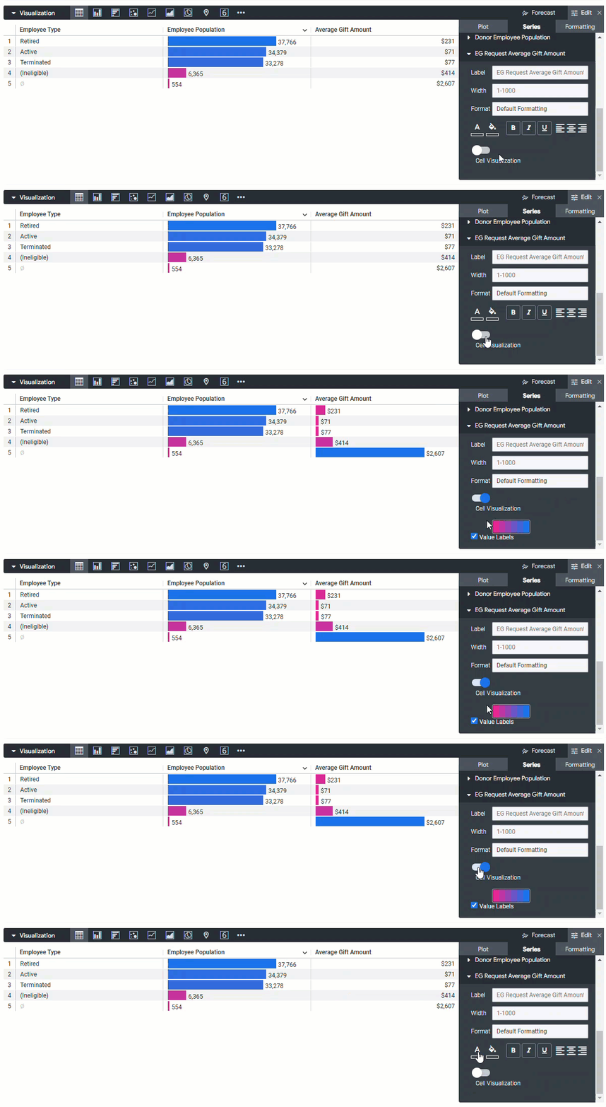
- Cell Visualization - The "Cell Visualization" option is turned on by default for the first measure in the table visualization, but can be applied to additional numeric columns as needed. This will display horizontal bar visualizations in the column cells. You can select different color palettes and choose to hide the Value Labels if needed.
What else do you need help with?
Not what you're looking for? Navigate to Understanding the Insights Table Visualization