When analyzing data within an Insights Explore, Analysts can customize their view of their data set using a wide range of visualization options, including tables, columns, bars, pies, maps, and more, each with its own set of configurations and compatibility requirements.
To ensure the selected visualization is compatible with the data set, Analysts should review the available options and consider factors such as the number and type of data fields. Once the appropriate visualization is identified, Analysts can further customize and refine the presentation to enhance the view of their program's data. Proceed as follows to leverage the visualization feature for your data analysis needs.
Step 1: Access the Insights tab
Log in to the CyberGrants platform and navigate to the Insights tab.

Step 2: Choose an Explore
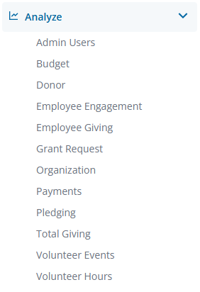
From the left-hand menu, Insights Analysts can click on Analyze to view the available Explores. Select the Explore that best aligns with your data analysis objectives.
Step 3: Create a Data Table
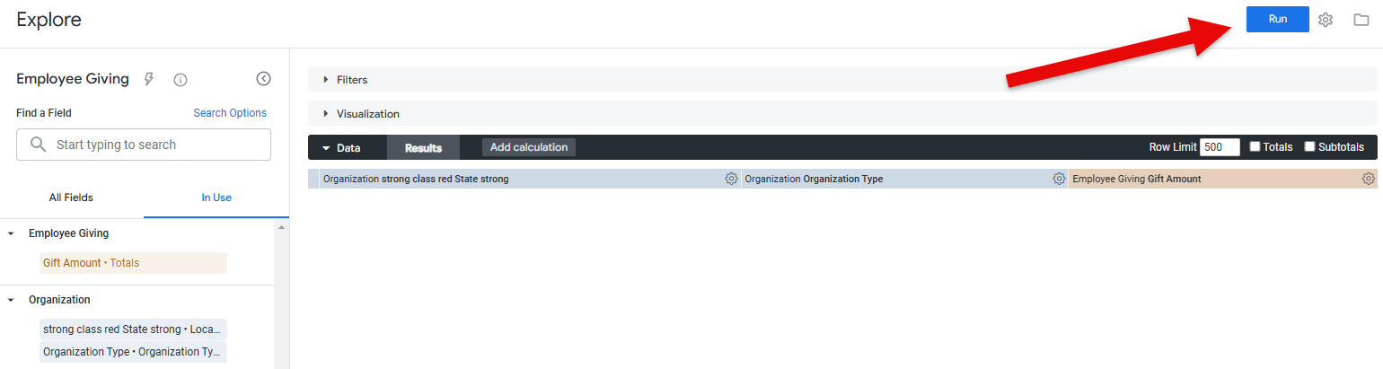
Customize your data set by adding field dimensions or measures as needed, then click "Run" to populate the values in the data table.
Step 4: View Visualization Options
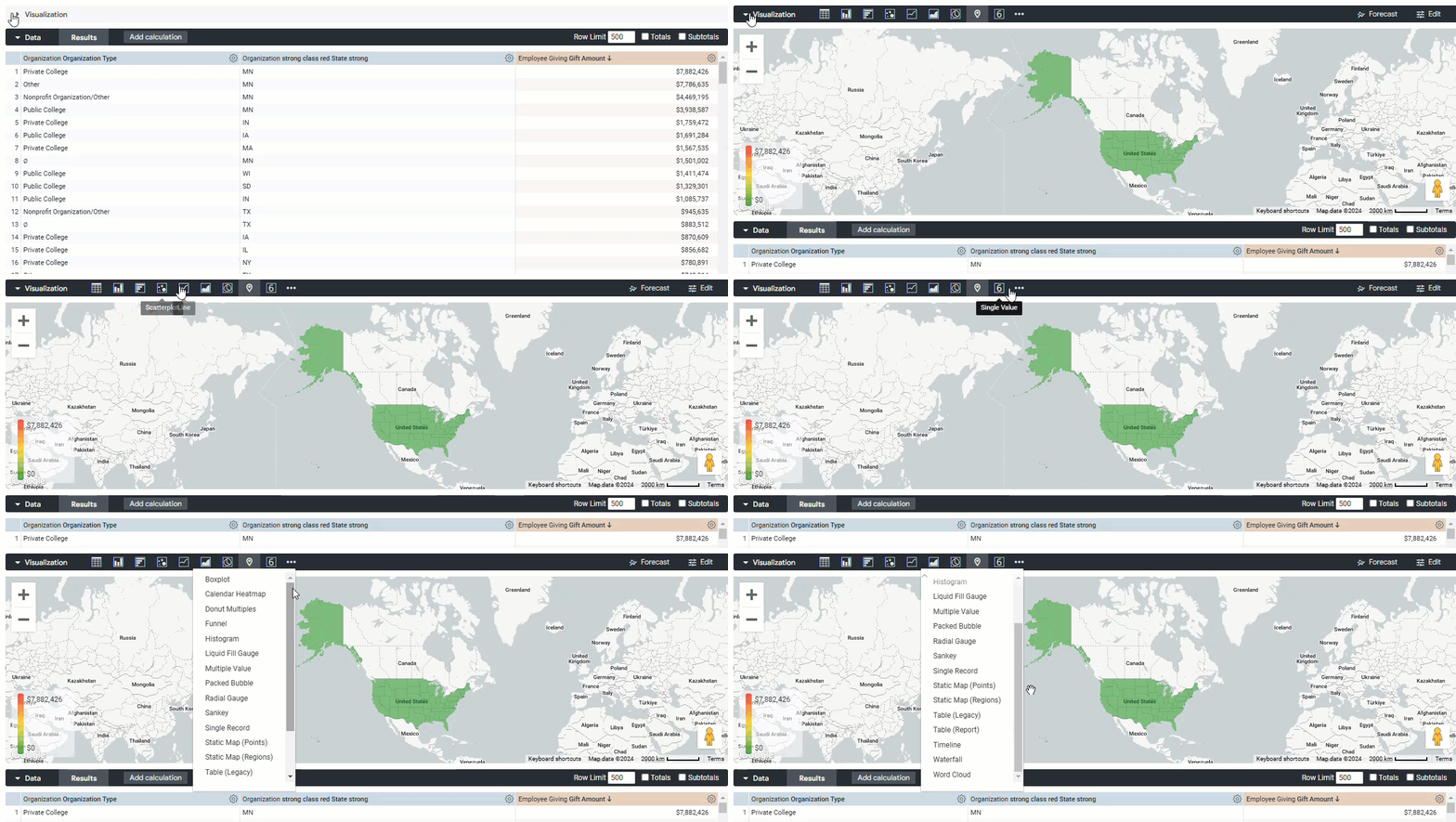
Directly above the data table you have been working with, you will find the "Visualization" section. A visualization is a graphical representation of the report data, which can be saved to a dashboard or as a standalone report. These visualizations can then be downloaded and shared with others.
Step 5: Determine Compatibility with Data Set
Not all visualizations may be compatible with your current data set.
- For example, a pie chart requires at least one dimension and one numerical measure, while a map visualization requires at least one "location" type of data field.
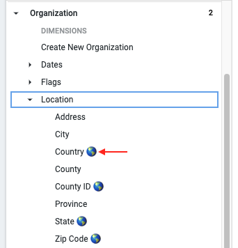
- NOTE: A globe icon will be displayed next to any mappable location fields. However, if any location-based standard fields have been renamed, the custom name will prevent the globe icon from being displayed.
Step 6: Configure Visualization Fields
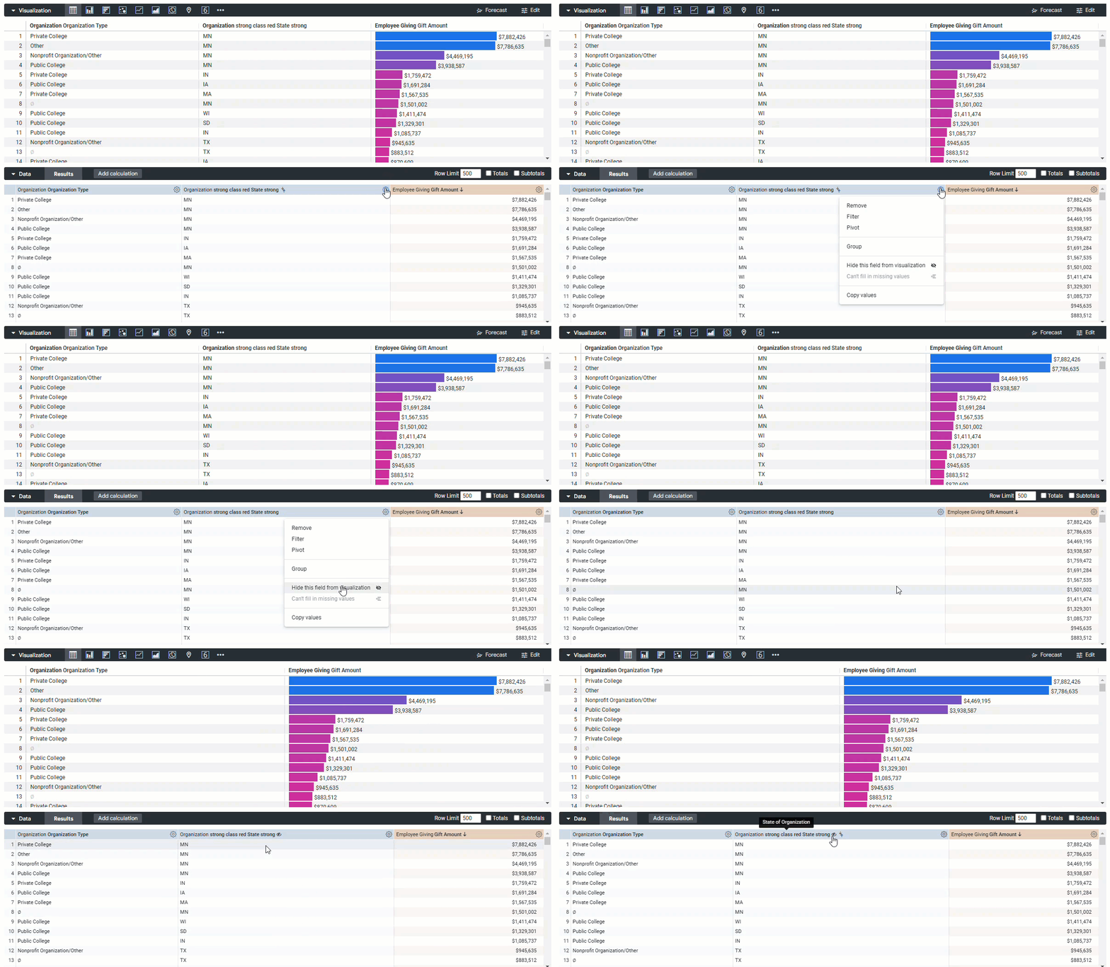
To select which fields from your data set should be used in the visualization, click the gear icon next to each field in the data table. Choose "Hide from Visualization" to exclude a field from being calculated within the chosen visualization.
- An eye icon with a slash through it will appear next to a field once it has been hidden from the visualization.
Step 7: Customize Visualizations
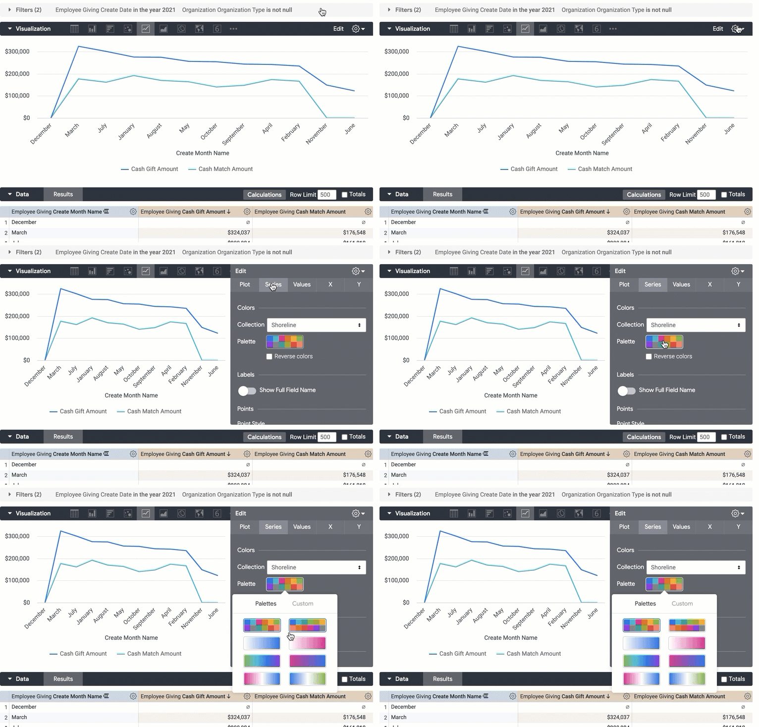
Each visualization type comes with its own set of configurations that can be adjusted by clicking the "Edit" or gear icon in the top right of the visualization section. For example, you could create a column chart with a scatterplot overlay to represent multiple data points.
- Depending on the visualization type, you can customize various aspects, such as colors, X/Y axis names, and legend names, and even combine multiple visualization types into a single view (if the data table supports it).
What else do you need help with?
Not what you're looking for? Return to Navigating Insights Explores Basics or access the Insights Analyze Basics Overview